Scrollytelling Component
Create cinematic animated sequences driven by page scrolling. This guide explains the properties panel features step-by-step to help you configure your desired effect.
1. Resources and Primary Assets
Connect your image sequence and define supporting graphic files to ensure smooth navigation.
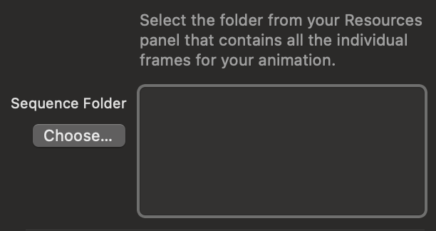
Sequence Folder
Select the folder from your Resources panel that contains all the individual frames of your animation ordered numerically. Make sure the files are not overly heavy to keep the animation smooth on the web.
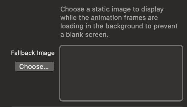
Fallback Image (Poster)
This static image is instantly shown to the user while the animation frames load in the background. It is crucial to prevent the display of annoying blank screens during the first moments of loading.
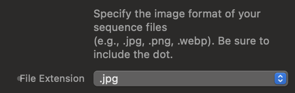
File Extension
Specify the exact format of the images that make up your sequence (e.g., .jpg, .webp, .png). Make sure all files within the folder share the same extension to avoid breaking the code.
2. Sequence Settings & Nomenclature
Align the component's logic with how you exported the files from your animation software.
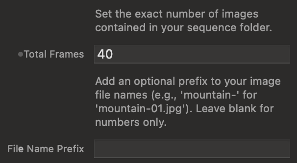
File Count and Prefixes
Tell the component how many total frames make up the animation. Additionally, if your files have text before the number (for example, "frame-01.jpg"), enter "frame-" in the prefix field. If they are named with numbers only, leave it blank.
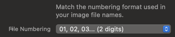
Numbering Format (Leading Zeros)
Match the numbering format to that of your files. If your file is named "001.jpg", it means the numbering has a fixed length of 3 digits, so you must select the option corresponding to 3 digits.
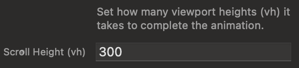
Scroll Duration (Height in vh)
Control the scroll space required to complete the entire sequence, expressed in vh (Viewport Height). A value of 300vh means the animation will complete over a scroll equal to 3 times the height of the visitor's screen.
3. Loading Indicators (Invisible Buffer)
Control the user's waiting experience by blocking interaction until a safety threshold is loaded.
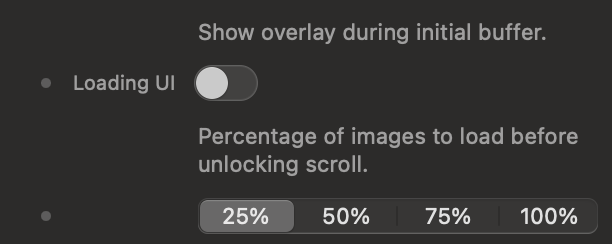
Activation and Unlock Threshold
Select how much of the animation must be downloaded in advance (e.g., 25%) before removing the loading screen and allowing scrolling. This "invisible buffer" ensures the animation doesn't stutter during use.
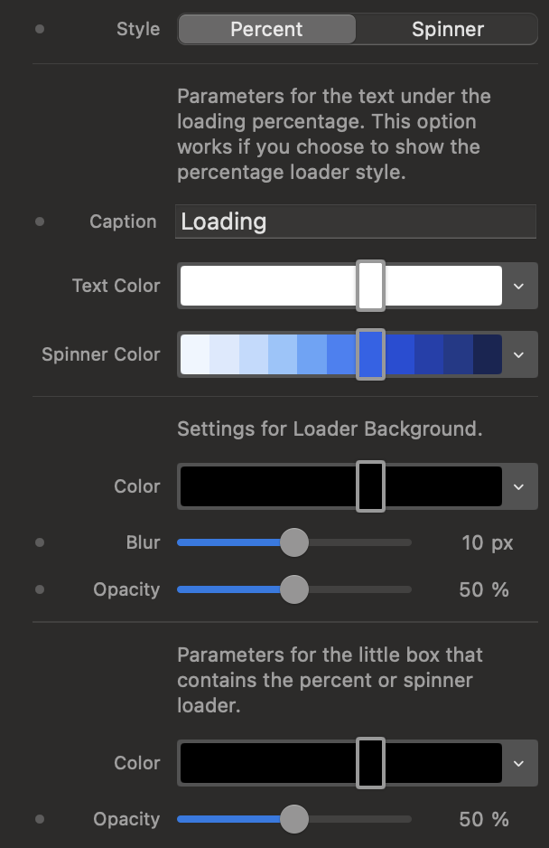
Loading Style
Choose between a percentage indicator or a circular spinner. You can customize the opacity, background color, and blur of the loading overlay to match your website's design.
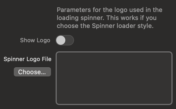
Logo in Spinner
If you opt for the Spinner indicator, you can upload and display your brand logo perfectly centered within the circular loading animation.
4. Trigger Points (Scroll Triggers)
Define the math that starts or ends the animation playback.
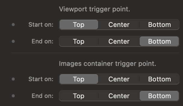
Viewport and Container Management
These options establish the connection point between page scrolling and the frames. By setting Start to "Top" and End to "Bottom", the animation will begin exactly when the section touches the top of the browser, and will end simultaneously with the end of the set scroll.
5. Container Style and Overlaps
Modify the spatial interaction of the sequence with the rest of the page elements.
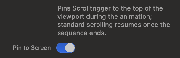
Pin to Screen
The core feature of Scrollytelling. When activated, the container remains fixed in the center of the screen while the user scrolls. Vertical scrolling triggers the frames and, only at the end of the sequence, the page resumes normal scrolling.
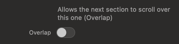
Overlap Effect
Allows the next section of your webpage to visually scroll over the animation once it's finished, creating an elegant, three-dimensional transition effect.
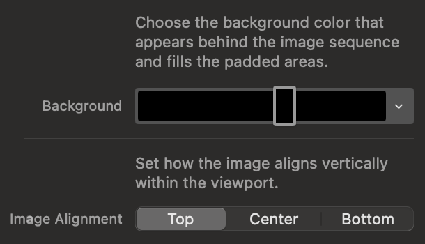
Background and Image Alignment
Define the fill color for empty areas of the container and decide whether the image sequence should be anchored to the top, center, or bottom of the Viewport.
6. Fades and HUD
Add graphic gradients and indicators to suggest actions to the user.
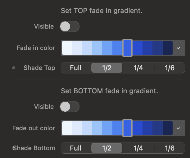
Fade In/Out Gradients
Apply overlapping gradients to the top or bottom of the canvas. Ideal for smoothly blending the edges of the animation with the colors of adjacent sections to avoid sharp graphic breaks.
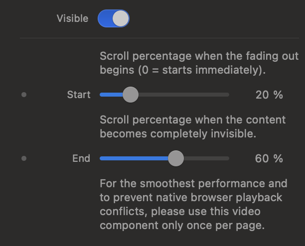
Scroll Hint Indicator
Enable an HUD (Head-Up Display) area at the bottom to suggest scrolling. You can set the exact percentages at which this indicator will start to fade and when it will disappear completely as you progress through the animation.