Motion Forge Core
The "brain" of the Motion Forge suite. This component intelligently and invisibly manages the loading of GSAP and its plugins, avoiding conflicts with Elements and offering you a powerful visual diagnostic tool.
1. Basic Configuration (Core & CDN)
Set up the main library and let the component integrate into the layout without leaving a trace.
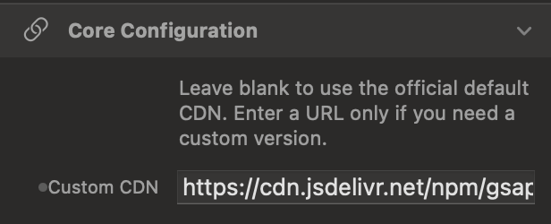
Custom CDN
By default, the Core uses the official optimized version of GSAP (v3.15). You can leave the field empty to use the standard one, or enter a custom URL if your project requires a specific version.
Zero Footprint Layout
The Core is a purely logical component. Thanks to the display: contents property, it is literally "invisible" to the browser's rendering engine.
2. Plugin Ecosystem
Activate superpowers for your animations, zero conflicts guaranteed.
Plugin Management
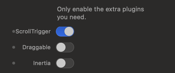
You have switches available to activate advanced extensions like ScrollTrigger (to animate on scroll), Draggable (for draggable elements), or Inertia (for realistic physical movements). Activate only what you need.
3. Debug Interface (HUD)
Monitor the health status of your GSAP environment in real-time directly on the page.
The Diagnostic Badge
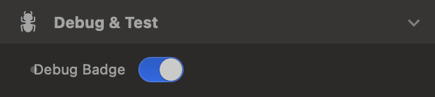
By activating the "Debug Badge" option, a small floating panel will appear in the top left. A pulsing green dot indicates that GSAP is ready; a red one indicates connection problems.
4. Interactive Simulator
Change the settings below to experiment with how the Motion Forge "Brain" manages controls in real-time.


- ScrollTrigger
- Draggable
Motion Forge Director
The "Director" of your animations. An invisible logical node that imparts movement, appearance, and 3D effect instructions to any other element of your Elements page, activating them exactly when you decide.
1. Target & Scope
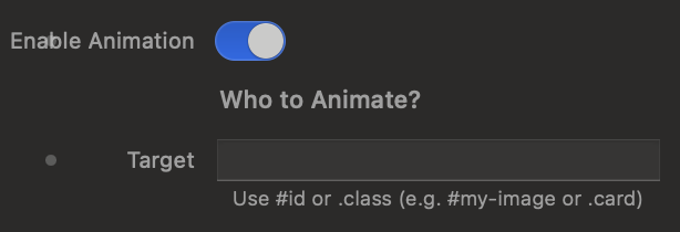
Define "who" should be animated. The Director works in the shadows, applying effects to the elements you specify.
Target Selector
Use standard CSS selectors to hook Elements items. Enter an ID (e.g. #hero-image) to animate a single element, or a class (e.g. .feature-card) to simultaneously animate multiple identical elements.
Scope: Children and Stagger
Instead of animating the main container, you can ask the Director to animate the Inner Children. This unlocks the Stagger effect: a cascading delay between the animation of one child and the next.

2. Visual Effects and Behavior
Choose how elements should enter or exit the scene, leveraging ready-to-use presets or full spatial controls.
Behavior: Entrance vs Exit
Choose whether the animation should make the element appear starting from an altered state (Entrance / From) or if it should move it away from its natural position to a new state (Exit / To).

Presets and Custom Control (3D)
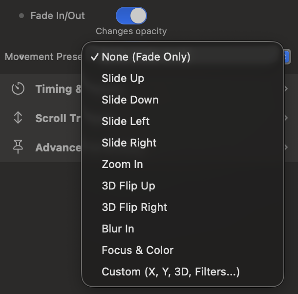
Use quick presets like Slide, Zoom, or 3D Flip for instant results. If you need surgical precision, activate the Custom mode to freely mix X/Y movements, 3D rotations, and optical filters (Blur and Grayscale).
3. Scroll Triggers
Connect your animations to page scrolling by precisely defining when the action starts and when it ends.
Start Point and End Point
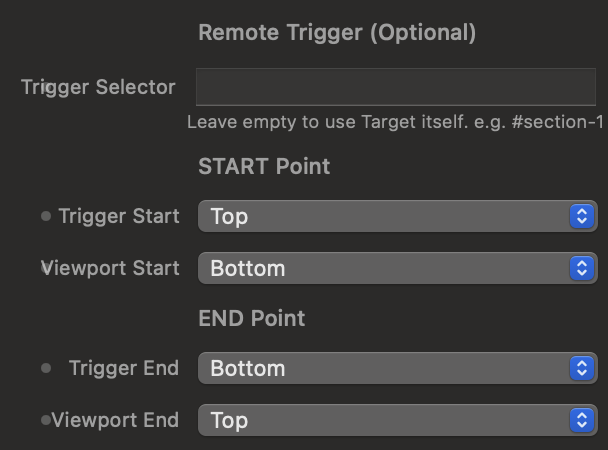
Define trigger points by crossing the Viewport lines (the user's screen) with the Trigger Element lines. You can even use a "Remote Trigger", making your Target's animation start when a completely different element enters the screen.
Scroll Triggers Simulator
Use the control panel on the left to understand how the guide lines behave. Blue lines control when the animation starts, red lines control when the animation ends or completes.

4. Pinning and Diagnostics
Advanced tools to pin elements to the screen and calibrate distances.
Enable Pin (Pin Element)
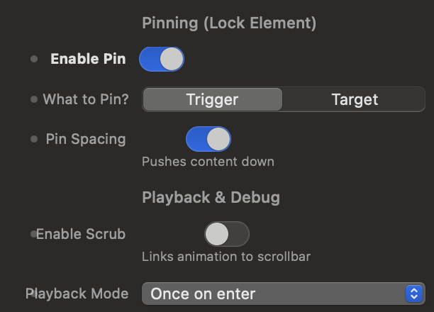
While the animation is running, you can "lock" the element on the screen, preventing it from scrolling with the rest of the page. Useful for creating fixed sections that change content on scroll.
Show Markers (Debug Labels)
By activating this option, GSAP will inject colored visual labels on the page (during Preview mode) showing the exact geometric position of Start and End. Essential for calibrating animations with pixel-perfect precision.

Motion Forge Draggable
Make your elements grabbable and draggable. An invisible logical component that applies physical rules, spatial limits, and elastic effects to any object on your Elements page.
1. Target & Movement
Choose what the user can drag and on which axes they can move it.
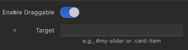
Target Selector
Use CSS selectors (e.g. #my-box or .image-card) to hook elements. The component works in the background, making the object instantly interactive.
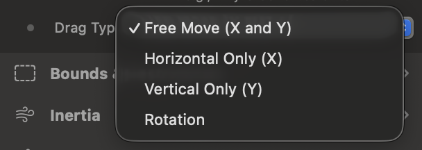
Drag Type (Axis Type)
Decide the element's freedom of movement: anywhere (X and Y), horizontal only like a carousel (X), vertical only like a dropdown (Y), or like a knob (Rotation).
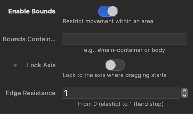
2. Limits and Obstacles (Bounds)
Prevent users from dragging elements off-screen or breaking the layout.
Bounds Container
By activating limits, you can designate a "fence" container (e.g. #game-area). The draggable element will hit the edges of this fence and won't be able to exit.
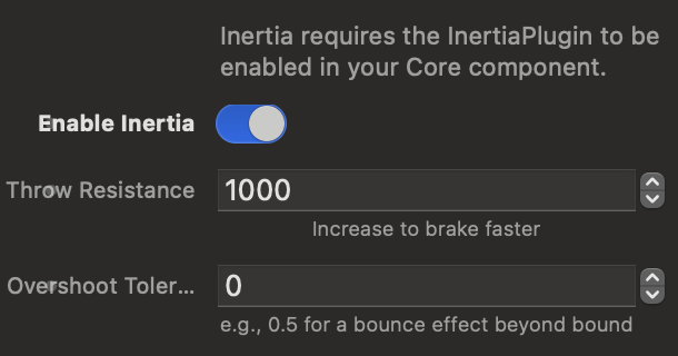
3. Inertia (Momentum)
Add physical realism: objects continue to slide after release.
Friction and Bounce
If activated (requires the plugin in the Core), the element won't stop abruptly as soon as the user releases the mouse, but will smoothly decelerate. You can control the friction (Throw Resistance) or allow a slight bounce on the edges (Overshoot).
4. Cursors and Advanced Levels
Customize the appearance of the mouse and element layering.
Hover and Dragging Cursor
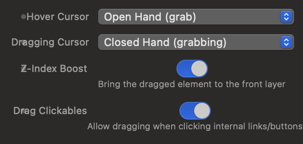
Choose which cursor to show when the user hovers over the element and which to show while they are actually dragging it, such as the classic "hand", the crosshair, or the standard arrow.
Z-Index Boost and Clickables
The Z-Index Boost automatically brings the element you are dragging to the foreground, preventing it from temporarily falling behind other objects. Drag Clickables allows you to drag an element even if the user clicks exactly on top of a link or button located inside it.
5. Snap Back (Elastic Return)
Magically returns the element to its place when the interaction ends.
"Elastic" Effect
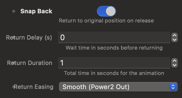
By activating Snap Back, as soon as the user stops dragging the object, it will return to its original position. You can customize the reaction time, animation duration, and braking type (Easing).
6. Interactive Physics Simulator
The options below follow the exact order in Elements. Try changing them and drag the target on the right.

Motion Forge Timeline
The main container for your animations. An invisible logical node that acts as a "stage", defining the trigger rules, scrolling, and pinning for all the keyframes you place inside it.
1. Configuration and Base Trigger
Name your sequence and decide which page element will act as the switch.
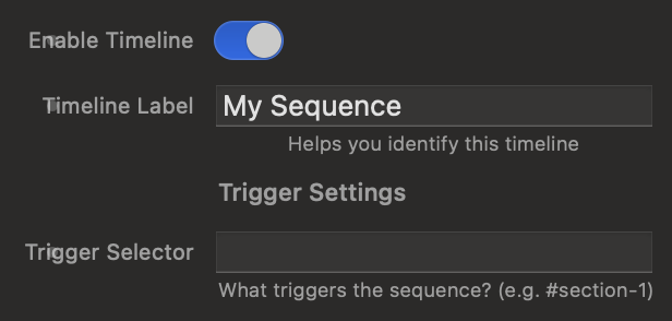
Trigger Selector
Enter the CSS selector (e.g., #hero-section or .text-block) of the element that, upon entering the screen, will trigger the animation. This element will become the reference point for the entire Timeline and all the Keyframes you insert into it.
2. Trigger Points (Scroll Triggers)
Connect the Timeline to page scrolling by precisely defining the start and end of the active area.
Start and End (Standard vs Custom)
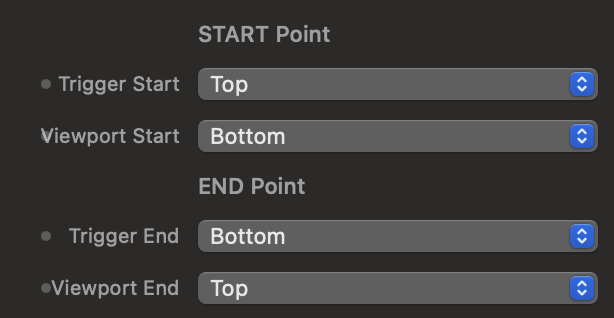
Define the trigger points by crossing the Viewport lines (the user's screen) with those of the Trigger Element.
You can use standard placements (Top, Center, Bottom) or the Custom mode. With the Custom mode, you can artificially extend the animation duration by entering relative values, for example, setting the end to bottom+=1500px or +=200vh.
Trigger Points Simulator
Use the control panel on the left to understand how the guide lines behave. Blue lines control when the Timeline begins, red lines control when the animation completes.

3. Playback and Pinning (Advanced)
Choose how the Timeline should be played and pin elements to create complex navigation experiences.
Scrub vs Playback Mode
By activating Scrub, the animation is physically bound to the mouse wheel: it advances and rewinds based on how much the user scrolls the page.
If you leave Scrub disabled, the Playback Mode takes over, where you can decide if the animation should play only once upon entry, reset when it leaves the screen, or automatically reverse (Play & Reverse).

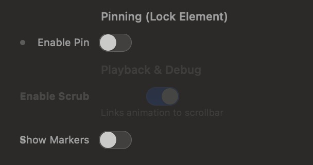
Pinning and Diagnostics
The Enable Pin option is extremely powerful: it allows you to pin an element to the screen, preventing it from scrolling with the rest of the page until the Timeline finishes playing. You can choose to pin the Trigger itself or specify a different element via "Pin Target".
Finally, by activating Show Markers, you make on-screen labels visible to fine-tune the Start and End points down to the millimeter during development.
Motion Forge Keyframe
The actors of your visual choreography. Each Keyframe component defines the movement, duration, effect, and temporal positioning of a single element or group of children, positioning itself within the parent Timeline.
1. Target & Setup
Tell the Keyframe which site element to move and how to interpret the scope.
Target
Enter the standard CSS selector to target the element you want to animate. You can target a unique ID (e.g., #main-hero-title) or a common class (e.g., .card-feature).

Scope and Child Selector
Decide the extent of the movement:
- Element: The effect is applied directly and solely to the Target block.
- Children: The Keyframe ignores the container and applies the animation to all its inner children in a cascade (Stagger).
By entering a class in Child Selector, you can filter the action to target only specific children while ignoring others (e.g., entering .icon inside a card).

2. Timeline Sequencing
Define the Keyframe's position on the time axis relative to other movements.
Timeline Position
Adjust the flow synchronization:
- After Previous (In Sequence): The Keyframe patiently waits for the animation of the Keyframe placed above it to completely finish before starting its own.
- With Previous (Synchronous): The Keyframe ignores the wait and overlaps, starting at the exact same instant as the previous Keyframe to move multiple objects together.

Automatic Sequencing Simulator
Change the insertion mode below to see how the Keyframes are arranged in the timeline track and how their execution changes on the top monitor as the playhead passes.

3. Visual Effect
Define the aesthetics, geometric, and spatial transformation of the movement.
Animation Behavior & Fade
Choose whether the Keyframe manages an entrance (Entrance / From), where the object emerges from the applied settings to settle into the layout, or an exit (Exit / To), where it moves away from its natural state.
The Fade In/Out switch allows you to add or remove opacity fading during the movement.

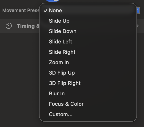
Movement Preset & Custom 3D Engine
Use ready-made Presets (Slide, Zoom, Blur In, Focus & Color) paired with a distance in pixels (Distance).
By selecting Custom, you unlock access to individual millimeter-precise axes: X/Y offsets, Scale, classic Z Rotation, and 3D Rotations on the X and Y axes with Origin calculation, capable of generating true perspective twists in the browser space, complemented by native blur and grayscale intensity filters.
4. Timing & Easing
Set the speed, initial pauses, and dynamic personality of the movement.
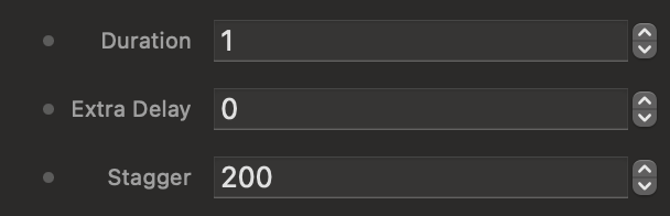
Duration, Delay, and Stagger
Configure the movement's duration (Duration) in seconds and an optional initial delay (Extra Delay) in milliseconds. If the scope is set to Children, the Stagger field will determine the incremental millisecond pause between the entry of one child and the next.
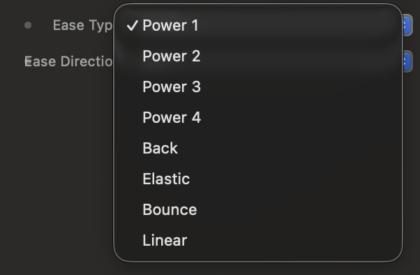
Ease Type and Ease Direction
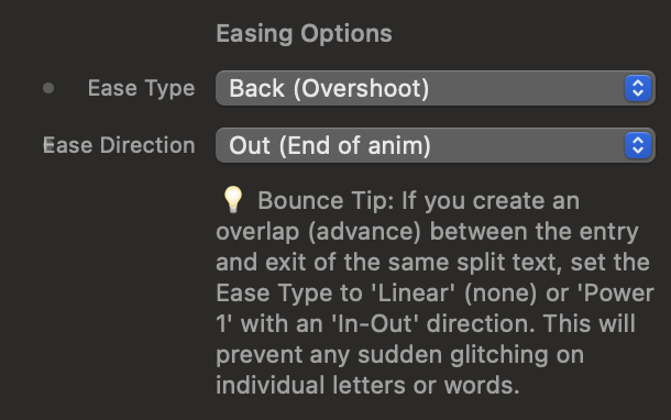
The Ease Type dictates the physics of the animation: smooth decelerations (Power), accelerations that pull back before shooting forward (Back), rubbery bounces (Elastic), or structured physical drops (Bounce).
With Ease Direction you decide where to apply the curve (Out at the end, In at the beginning, In-Out on both sides).
Motion Forge SplitText
The advanced typographic animation engine. It breaks down any text element into individual characters, words, or lines, allowing you to create 2D/3D visual choreographies, typewriter effects, continuous waves, and chaotic explosions synchronized with the scroll.
1. Target Setup and Text Geometry
Define which text to animate, how to split it, and protect your page's accessibility and layout.
Target Selector and Split Type
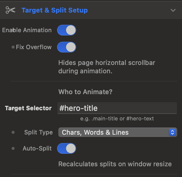
Enter the CSS selector (e.g., .hero-title or #main-heading) of the text you want to animate. Using the Split Type menu, you can decide the depth of the split: you can divide the text into just lines (Lines Only), words (Words), characters (Chars), or complete combinations.
By enabling Auto-Split, the component dynamically recalculates the splits when the user resizes the browser window (Window Resize), ensuring that lines perfectly adapt to responsive layouts without breaking the animations.
Masking and ARIA Accessibility
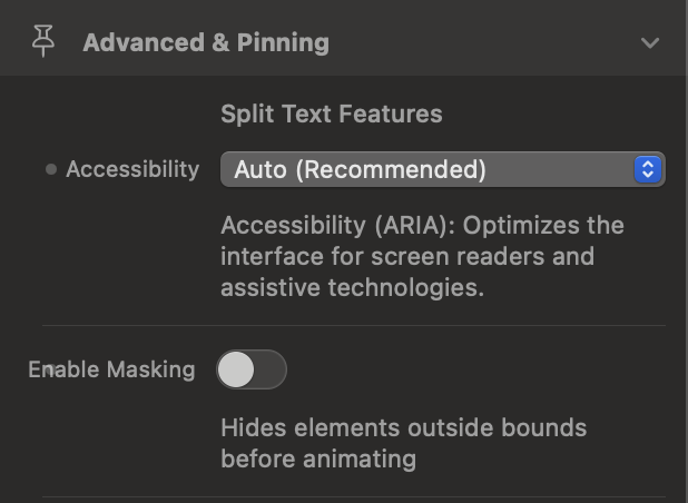
The Enable Masking feature wraps each split element (line, word, or letter) in an invisible container with overflow: hidden. This allows you to create elegant "out of nowhere" reveal effects, making words emerge from their own bottom edge without invading the surrounding space.
Furthermore, thanks to Accessibility (ARIA) set to Auto, the component hides the fragmented letters from screen readers for the visually impaired, keeping only the intact original text readable.
display: contents !important; to the component's nodes. This ensures that inserting the animator never breaks your site's CSS Grid or Flexbox layouts.
2. Movement Presets and Visual Effects
Choose the visual personality of your animation, utilizing 3D rotations, optical filters, and procedural effects.
Behavior and Special Presets
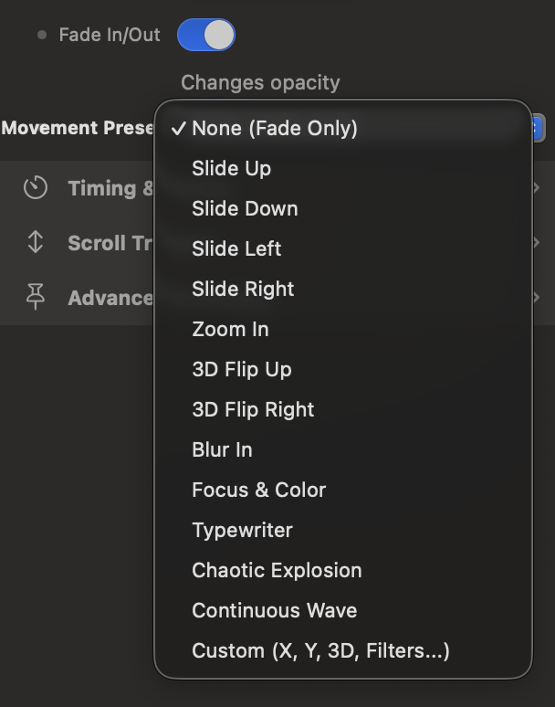
The Behavior parameter defines whether the animation is an entrance (From, the text arrives from a modified state to normality) or an exit (To). In addition to classic directional entrances (Slide Up/Down/Left/Right) and Zoom, SplitText includes advanced presets:
• 3D Flip: Rotates characters on the X or Y axis, activating a 3D perspective 1000px deep.
• Typewriter: Uses step interpolation (steps(1)) to simulate instant typewriter keystrokes.
• Chaotic Explosion: Scatters letters or words in space with random coordinates, rotations, and scales for a dramatic re-entry.
• Continuous Wave: Generates an infinite smooth looping wave that crosses the text (using the sine.inOut easing and yoyo return).
Custom Space (3D) and CSS Filters
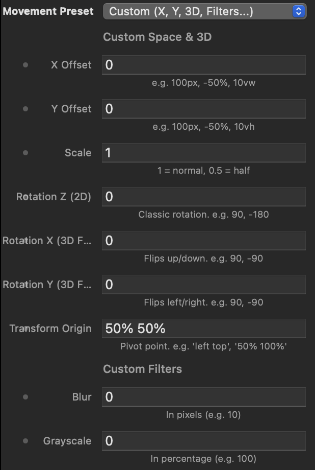
By selecting the Custom preset, you unlock absolute granular control. You can translate elements on X and Y (in pixels, percentages, or viewport units), apply 2D rotations (Z Axis) and 3D rotations (X and Y Axes), and redefine the pivot point via Transform Origin (e.g., 50% 100% to make letters rotate from the base).
Finally, you can combine mechanical movements with real-time optical filters by setting blur values (Blur in pixels) and desaturation (Grayscale in percentage).
Interactive Stagger and Preset Simulator
Use the control panel to test how different Presets and Stagger directions (the cascading delay between individual letters) modify the visual perception of the text.
3. Timing, Stagger, and Easing
Adjust the rhythm, fluidity, and millimeter-precise elasticity of your typographic sequence.
The Art of Stagger (Cascading Delay)
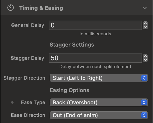
The Stagger Delay is the time (in milliseconds) that elapses between the start of one split element's animation and the next. A value of 50ms on individual letters creates a continuous fluid effect, while on entire lines, it generates a rhythmic reading pace.
Through Stagger Direction, you define the origin of the dynamic wave: from left to right (Start), from the inside out (Center), from the edges to the center (Edges), or in a completely unpredictable order (Random).
Acceleration Curves (Easing Options)
The Ease Type defines the character of the movement. You can opt for smooth, natural transitions (Power1 or Power2), strong, dramatic accelerations (Power4, Expo), or physical, bouncy, responsive effects like Back (overshooting the endpoint and settling), Elastic, or Bounce.
With Ease Direction, you decide whether to apply the curve at the beginning (In), at the end (Out, the most natural for entrances), or in both phases (In-Out).

4. ScrollTrigger, Scrub, and Pinning (Advanced)
Perfectly synchronize the appearance of texts with page scrolling and pin elements on screen.
Trigger Points and Remote Trigger
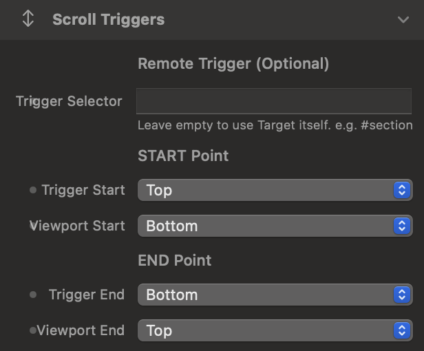
As with the Timeline, define the trigger points by crossing the Viewport lines (the screen) with those of the Trigger Element (e.g., start when the top of the text reaches 80% of the screen).
Using the Remote Trigger (Trigger Selector) field, you can make a text's animation governed by the entrance of a completely different element on the page (e.g., make the title appear when the user reaches a specific image above).
Scrub, Playback Mode, and Pinning
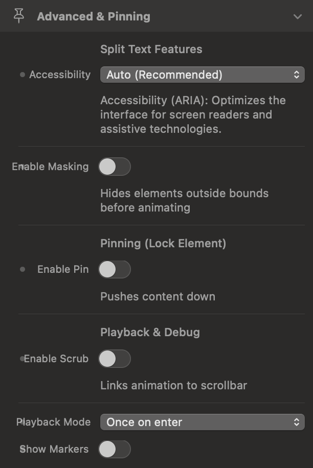
By activating Scrub, the typographic animation physically links to the mouse wheel: letters animate forward or backward exactly based on how much the user scrolls. If you disable it, the Playback Mode allows you to play the animation only once, reset it when it leaves the screen, or automatically reverse it upon exit.
Finally, with Enable Pin, you can lock the text container fixed on the screen until all lines or words have completed their entrance sequence, maintaining the correct spacing in the page flow via Pin Spacing.
Motion Forge TextFrame
Il nodo tipografico della Timeline. Unisce il motore di scomposizione del testo di SplitText con il controllo sequenziale di un Keyframe, permettendo di inserire coreografie di caratteri, parole e righe direttamente nel flusso di un'animazione complessa.
1. Target Setup e Scomposizione Tipografica
Definisci quale testo animare, la profondità del taglio tipografico e proteggi il layout durante il caricamento.
Target Selector e Prevent FOUC
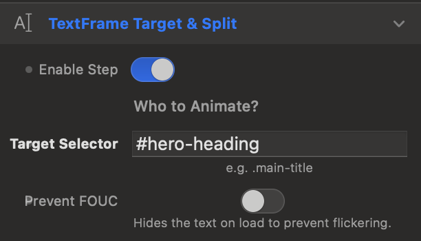
Inserisci il selettore CSS (es. .main-title o #hero-heading) dell'elemento testuale da animare all'interno della Timeline. Attivando Prevent FOUC (Flash of Unstyled Content), il componente nasconde il testo nell'istante esatto del caricamento della pagina, evitando fastidiosi sfarfallii o scatti visivi prima che il motore geometrico calcoli le posizioni dei singoli caratteri.
Split Type, Auto-Split e ARIA
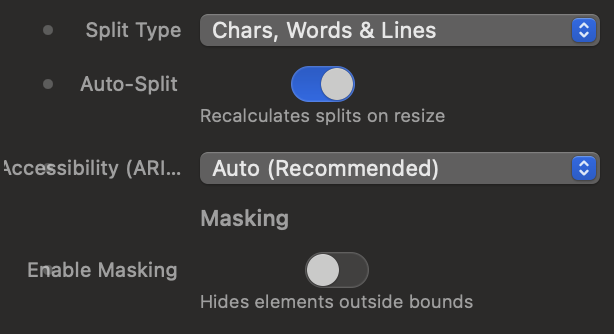
Tramite Split Type decidi il livello di frammentazione del testo: puoi dividere in singole righe (Lines Only), parole (Words), lettere (Chars) o combinazioni gerarchiche complesse.
Attivando Auto-Split, il componente ricalcola dinamicamente i tagli al ridimensionamento del browser, mantenendo il layout responsivo intatto. Infine, l'opzione Accessibility (ARIA) in modalità Auto oscura le lettere frammentate agli screen reader, preservando la leggibilità per gli utenti non vedenti.
display: none !important; al contenitore del TextFrame, garantendo che non occupi mai spazio fisico nel DOM o spezzi le griglie della pagina.
2. Sequenziamento e Temporizzazione (Timeline Track)
Posiziona la tua animazione di testo sull'asse temporale della Timeline padre rispetto agli altri Keyframe.
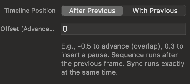
Timeline Position e Offset
Regola la sincronizzazione del TextFrame nel flusso di riproduzione:
- After Previous (In Sequence): L'animazione attende il completamento del blocco precedente nella Timeline per iniziare.
- With Previous (Synchronous): L'animazione si avvia al medesimo istante del blocco precedente, sovrapponendosi.
Il campo Offset ti consente di anticipare (es. inserendo un valore negativo come -0.5 per creare una sovrapposizione) o ritardare (es. 0.3 per inserire una pausa scenica) l'attacco della sequenza.
Simulatore di Sequenziamento Tipografico
Modifica la modalità di inserimento e lo Stagger qui sotto per osservare come i singoli caratteri del TextFrame si posizionano nella traccia temporale e come il monitor riproduce l'animazione al passaggio della Playhead.
3. Effetti Visivi e Preset di Movimento
Scegli l'estetica, il comportamento direzionale e le trasformazioni 3D delle tue parole.
Behavior, Fade e Mascheramento
Con Behavior decidi se le lettere devono entrare (Entrance / From), emergendo dallo stato modificato verso la normalità del layout, o uscire (Exit / To). L'interruttore Fade In/Out aggiunge una dissolvenza progressiva sulla trasparenza.
Attivando Enable Masking, ogni riga o parola viene racchiusa in una maschera invisibile di ritaglio: questo fa apparire le lettere dal proprio bordo inferiore senza invadere lo spazio adiacente (ideale per i titoli moderni).

Movement Presets e Spazio Custom 3D
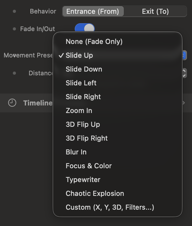
Seleziona uno dei preset pronti all'uso (Slide direzionali, Zoom, 3D Flip, Blur In, Focus & Color, Typewriter o l'esplosione caotica Chaotic Explosion), regolando la distanza di scorrimento in pixel tramite Distance.
Scegliendo il preset Custom, sblocchi il controllo granulare dell'asse geometrico: traslazioni X/Y (pixel, percentuali o viewport units), Scala, rotazione classica Z e rotazioni prospettiche avanzate su Asse X (3D Flip Up) e Asse Y (3D Flip Right) con calcolo del punto di perno (Transform Origin), integrando persino filtri CSS per sfocature e desaturazione.
4. Durata, Stagger ed Easing
Fin tuning della velocità, del ritardo a cascata tra i caratteri e della fisica del movimento.
Duration, Delay e Stagger Settings
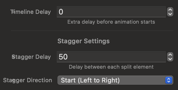
Configura la durata globale dell'animazione per singolo elemento (Duration in secondi) e un ritardo di avvio (Timeline Delay in millisecondi). Il cuore del componente è lo Stagger Delay, ovvero il tempo (in ms) che intercorre tra l'avvio della prima lettera e la successiva.
Tramite Stagger Direction puoi creare un'onda di movimento dinamica che parte da sinistra (Start), dall'interno verso l'esterno (Center), dai bordi verso il centro (Edges), da destra a sinistra (End) o in un ordine completamente imprevedibile (Random).
Curve di Accelerazione (Easing Options)
L'Ease Type definisce la personalità fisica dell'animazione tipografica: decelerazioni naturali e morbide (Power1-4), accelerazioni di slancio che arretrano prima di scattare (Back), rimbalzi elastici gommosi (Elastic) o cadute fisiche strutturate (Bounce).
Con Ease Direction stabilisci in quale fase applicare la curva geometrica (Out in uscita verso lo stato finale, In in entrata, o In-Out su entrambi gli estremi).